Web Application
EduTech: Learning Platform
A responsive learning-platform website and signup flow, designed in Figma and implemented in semantic HTML5 and CSS3.
Overview
EduTech is a responsive education-platform website covering the marketing home page and an account-creation flow. The experience was designed from user flows and wireframes in Figma, then translated into a working website with semantic HTML5, CSS3, and Bootstrap 5.
Problem statement
Learners evaluating an education platform need to quickly understand what it offers and decide whether to sign up, on whatever device they happen to be using. The page had to communicate the product clearly while staying consistent and accessible across desktop, tablet, and mobile.
Project goals
- Design a responsive landing experience from user flows and low-fidelity wireframes through high-fidelity UI screens
- Implement the approved design in semantic HTML5 and CSS3 using Flexbox, CSS Grid, responsive breakpoints, and reusable design tokens
- Build layouts for desktop, tablet, and mobile viewports while keeping visual consistency and accessibility considerations
- Review the implementation against the design and refine spacing, typography, and component behavior
Process
From user flows to wireframes
The project started with user flows and low-fidelity wireframes to agree on the page structure, before investing in high-fidelity UI screens in Figma.
Building the front end
The approved design was implemented as a semantic HTML5 and CSS3 build on Bootstrap 5, using Flexbox, CSS Grid, responsive breakpoints, and design tokens so the layout could scale across viewports.
Design review and refinement
The implementation was reviewed screen-by-screen against the design, and spacing, typography, and component behavior were refined until the build matched the approved UI.
Final screens
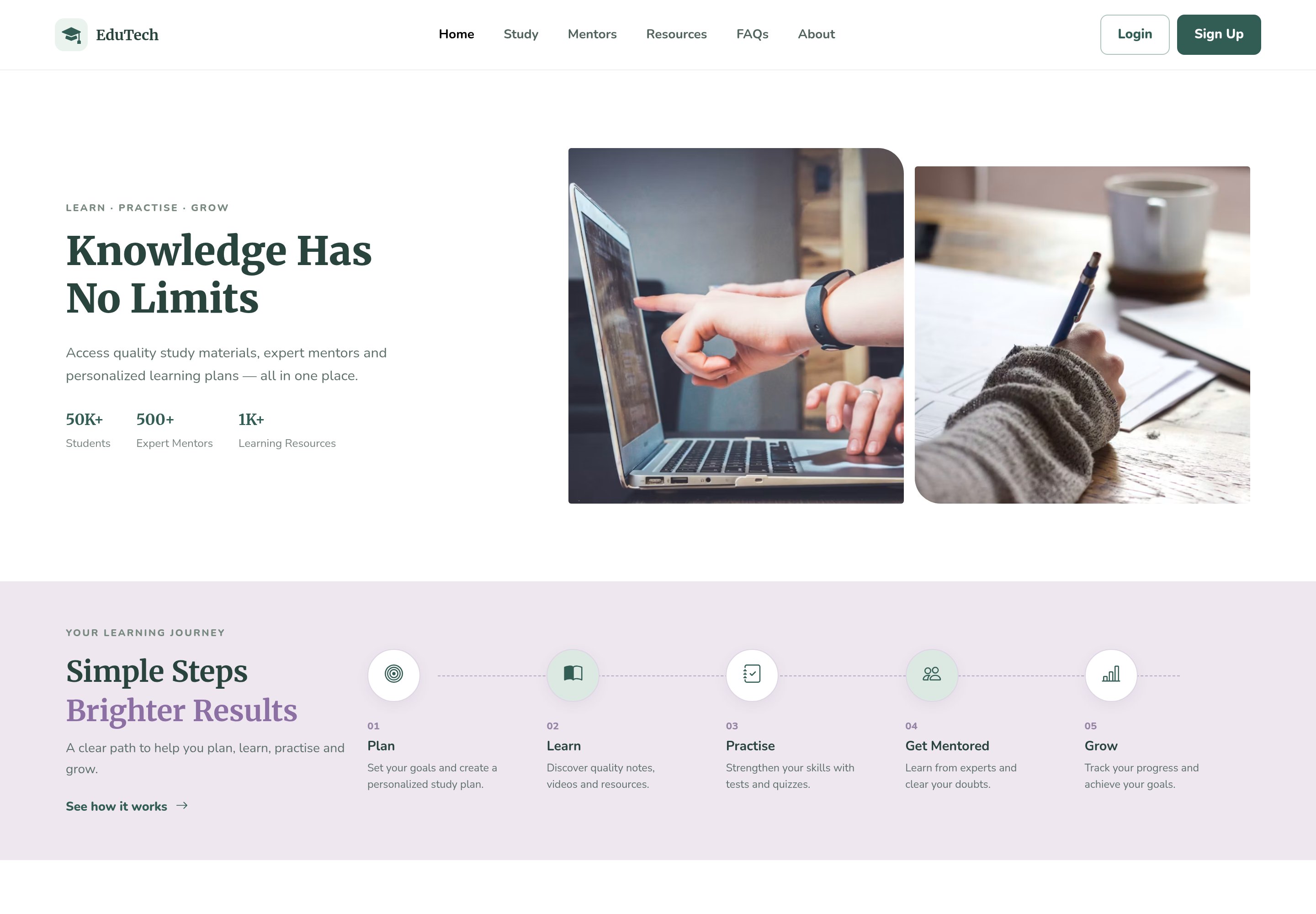

Design decisions
Typography-led hierarchy
Merriweather for headings and Nunito for body text give the page an editorial, trustworthy feel suited to education, with a clear scale from hero headline down to body copy.
A green-and-lavender palette as variables
The palette, deep green, mint, and lavender, is defined once as CSS custom properties, making the design tokens reusable across pages and viewports.
A guided journey section
A numbered five-step timeline (Plan, Learn, Practise, Get Mentored, Grow) explains the product in one glance instead of long paragraphs of copy.
Proof through structure
Stats (students, mentors, resources), subject cards, and mentor profiles are laid out as scannable grids so credibility is visible without reading everything.
Key learnings
- Taking a design from user flows and wireframes through high-fidelity screens to a working HTML5/CSS3 build, end to end
- Building responsive layouts for desktop, tablet, and mobile with Flexbox, CSS Grid, and breakpoints
- Reviewing an implementation against the design and refining spacing, typography, and component behavior until they match
Next project
GoTrip: Travel Planner